1- Load the R package we will use.
- Quiz questions
• Replace all ???s. These are answers on your moodle quiz.
• Run all the individual code chunks to make sure the answers in this file correspond with your quiz answers
• After you check all your code chunks run then you can knit it. It won’t knit until the ??? are replaced
• The quiz assumes you have watched the videos had worked through the exercises in exercises_slides-1-49.Rmd
- Pick one of your plots to save it as preview plot. Use the ggsave command at the end of tyhe chunk of the plot that you want to preview
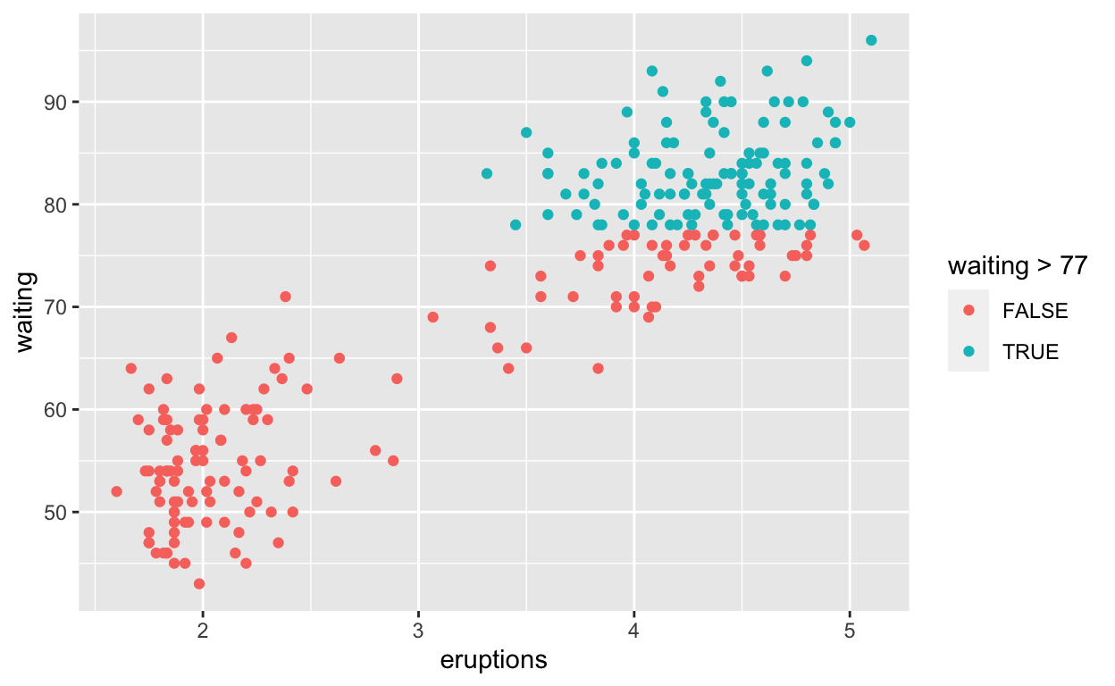
Question: modify slide 34
• Create a plot with faithful dataset • add points with geom_point * assign the variable eruptions to the x-axis * assign the variable waiting to the y-axis * colour the points according to whether waiting is smaller or greater than 77
ggplot(faithful) +
  geom_point(aes(x = eruptions, y = waiting,
                 colour = waiting > 77))
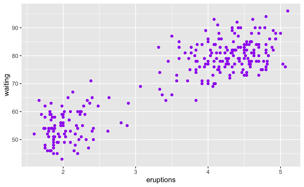
Question: modify intro-slide 35
• Create a plot with the faithful dataset • add points with geom_point * assign the variable eruptions to the x-axis * assign varibale waiting to the y-axis * assign the colour purple to all points
ggplot(faithful) +
  geom_point(aes(x = eruptions, y = waiting),
             colour = "purple")
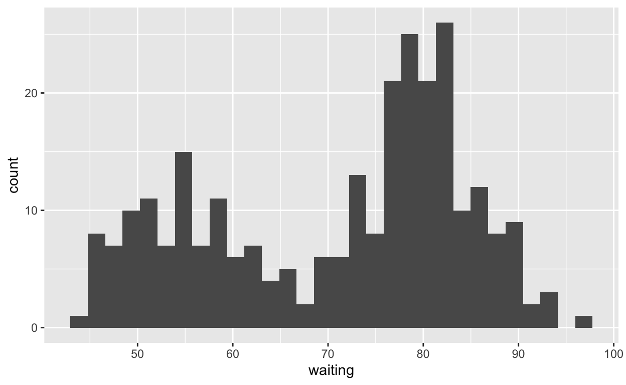
Question: modify intro-slide 36
• Create a plot with the faithful dataset • use geom_histogram() to plot the distribution of waiting time * assign the variable waiting to the x-axis
ggplot(faithful) +
  geom_histogram(aes(x = waiting))
Question: modify geom-ex-1
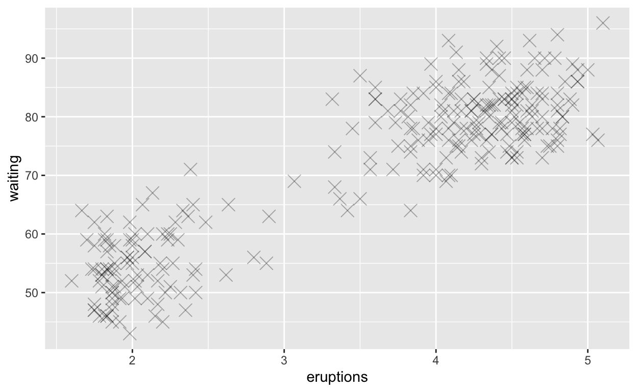
• See how shapes and sizes of points can be specified here: https://ggplot2.tidyverse.org/articles/ggplot2-specs.html#sec:shape-spec • Create a plot with the faithful dataset add points with geom_point assign the variable eruptions to the x-axis assign the variable waiting to the y-axis set the shape of the points to cross set the point size to 4 set the point transparency 0.3
ggplot(faithful) +
  geom_point(aes(x = eruptions, y = waiting),
             shape = "cross", size = 4, alpha = 0.3)
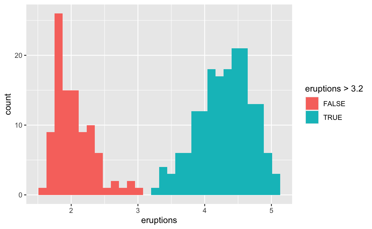
Question: modify geom-ex-2
• Create a plot with the faithful dataset • use geom_histogram() to plot the distribution of the eruptions (time) • fill in the histogram based on whether eruptions are greater than or less than 3.2 minutes
ggplot(faithful) +
  geom_histogram(aes(x = eruptions, fill = eruptions > 3.2))
Question: modify stat-slide-40
• Create a plot with the mpg dataset • add geom_bar() to create a bar chart of the variable manufacturer
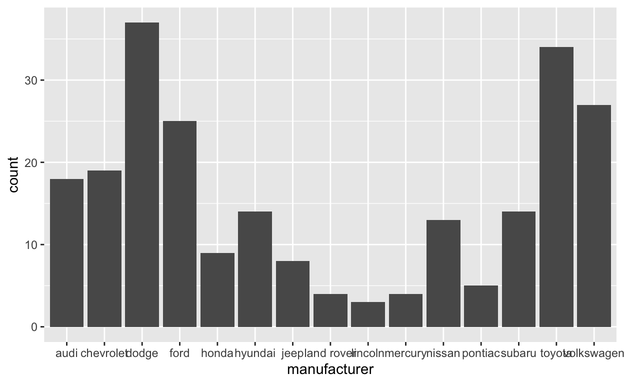
Question: modify stat-slide-41
• change code to count and to plot the variable manufacturer instead of class
mpg_counted <- mpg %>%
  count(manufacturer, name = "count")
ggplot(mpg_counted) +
  geom_bar(aes(x = manufacturer, y = count), stat = "identity")

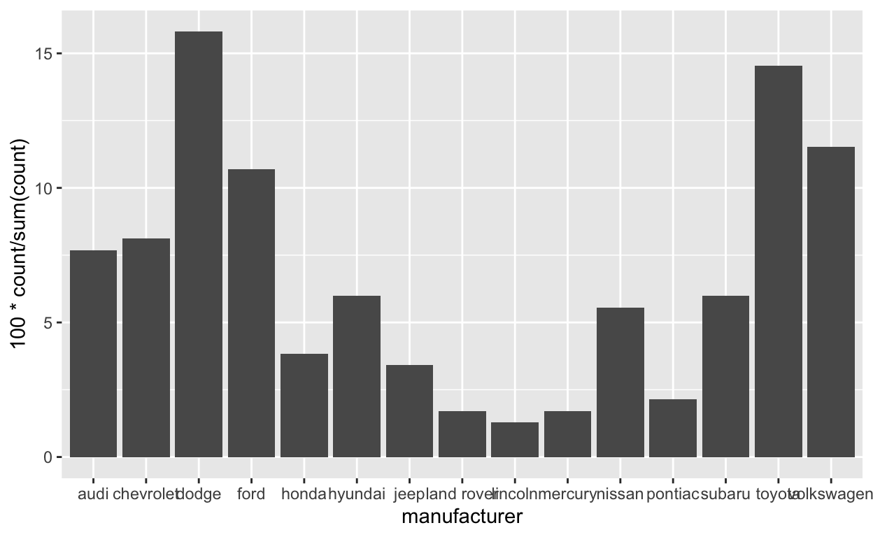
Question: modify stat-slide-43
• change code to plot bar chart of each manufacturer as a percent of total • change class to manufacturer
ggplot(mpg) +
  geom_bar(aes(x = manufacturer, y = after_stat(100*count / sum(count))))
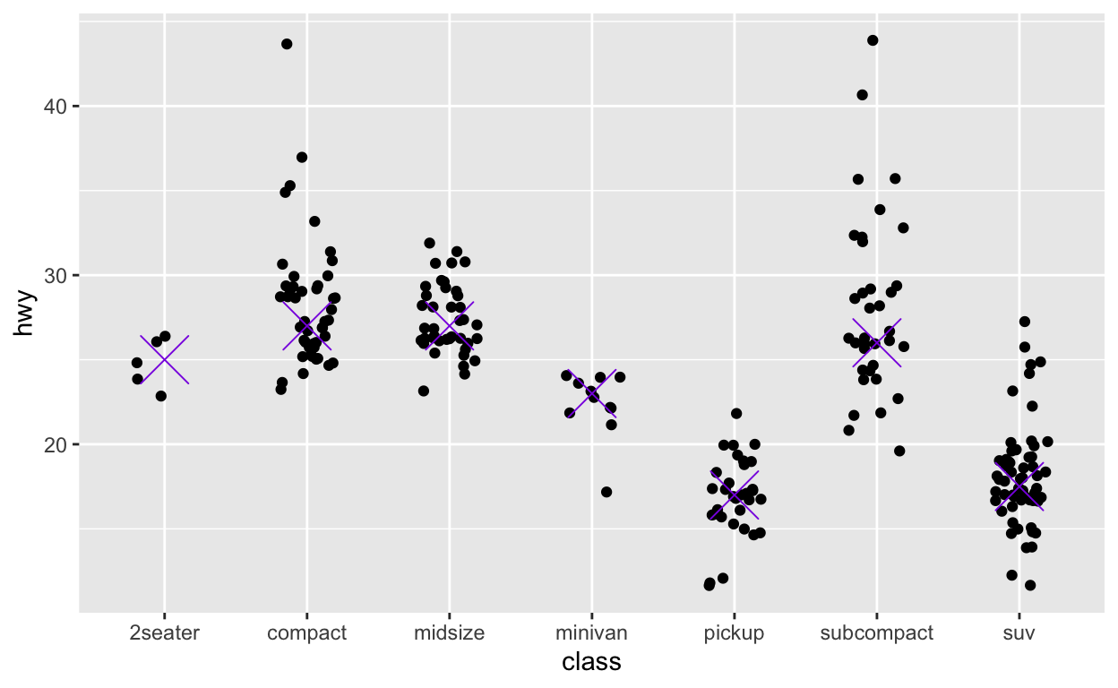
Question: modify answer to stat-ex-2
for reference see: https://ggplot2.tidyverse.org/reference/stat_summary.html?q=stat%20_%20summary#examples
• Use stat_summary() to add a dot at the median of each group • color the dot blueviolet • make the shape of the dot cross • make the dot size 9
ggplot(mpg) +
  geom_jitter(aes(x = class, y = hwy), width = 0.2) +
  stat_summary(aes(x= class, y = hwy), geom = "point",
               fun = "median", color = "blueviolet",
               shape = "cross", size = 9)